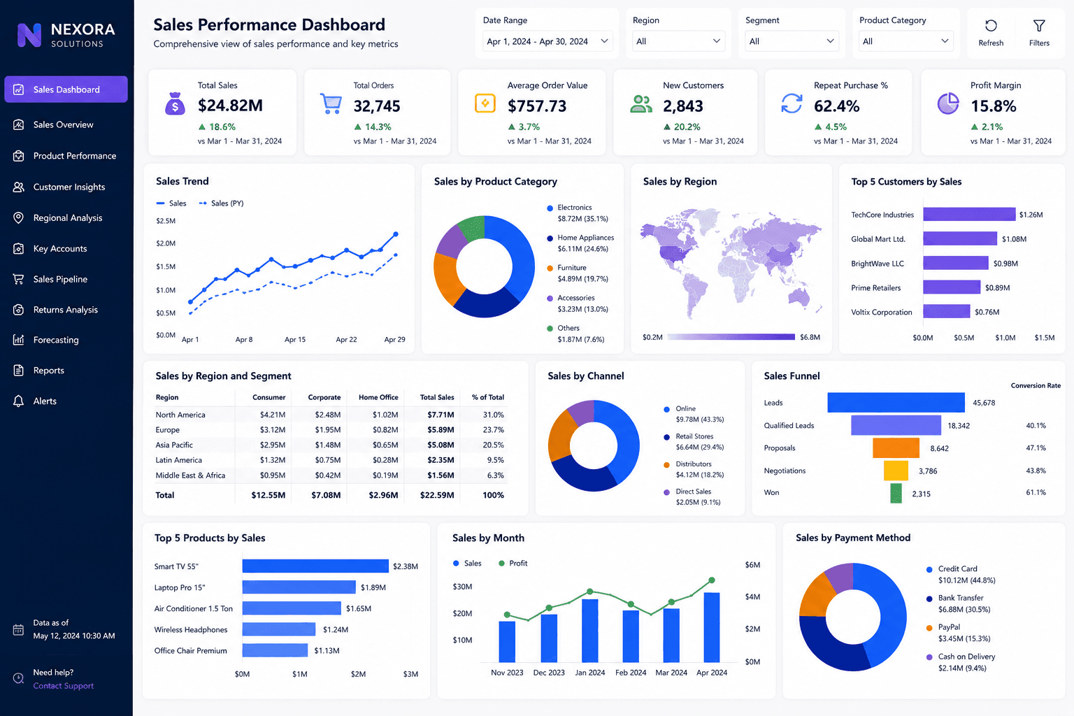
Summary
This Tableau dashboard was created for users who needed a more visual way to analyze sales performance.
Project objectives
- Make sales data easier to explore visually.
- Support interactive sales reporting.
- Improve sales storytelling.
Business challenge
The client had reports but needed better interactivity and visual exploration.
How the dashboard was built
The data was prepared, calculated fields were created, and visuals were designed to help users move from overview to detailed analysis.
Solution delivered
We built a Tableau dashboard with interactive filters, calculated fields, and clean visual storytelling.
Key insights of this dashboard
This dashboard helps users move from a high-level performance view into more specific business insights. It is designed to make trends, gaps, and opportunities easier to identify without relying on manual spreadsheet reporting.
- Sales trend exploration
- Customer segment performance
- Region comparison
- Revenue contribution analysis
- Interactive filtering
Client feedback
The client said the dashboard made sales performance easier to explain to stakeholders.
What you can expect
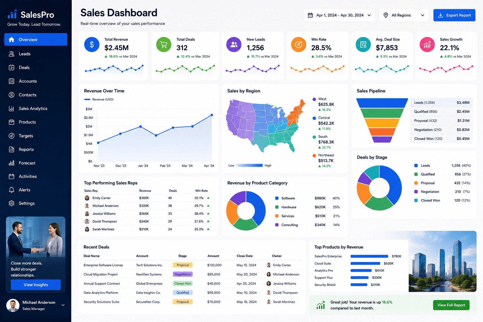
This type of dashboard is useful for teams that want interactive sales analysis.
Related services
How to use this dashboard
Start with the KPI cards, then use the visuals to compare trends, identify performance changes, and drill into the areas that need attention. In a live version, users can interact with slicers, charts, bookmarks, and report pages.
The interaction, download, and open report options are locked for now. Users can sign up and request the complete dashboard file when you are ready to provide access.