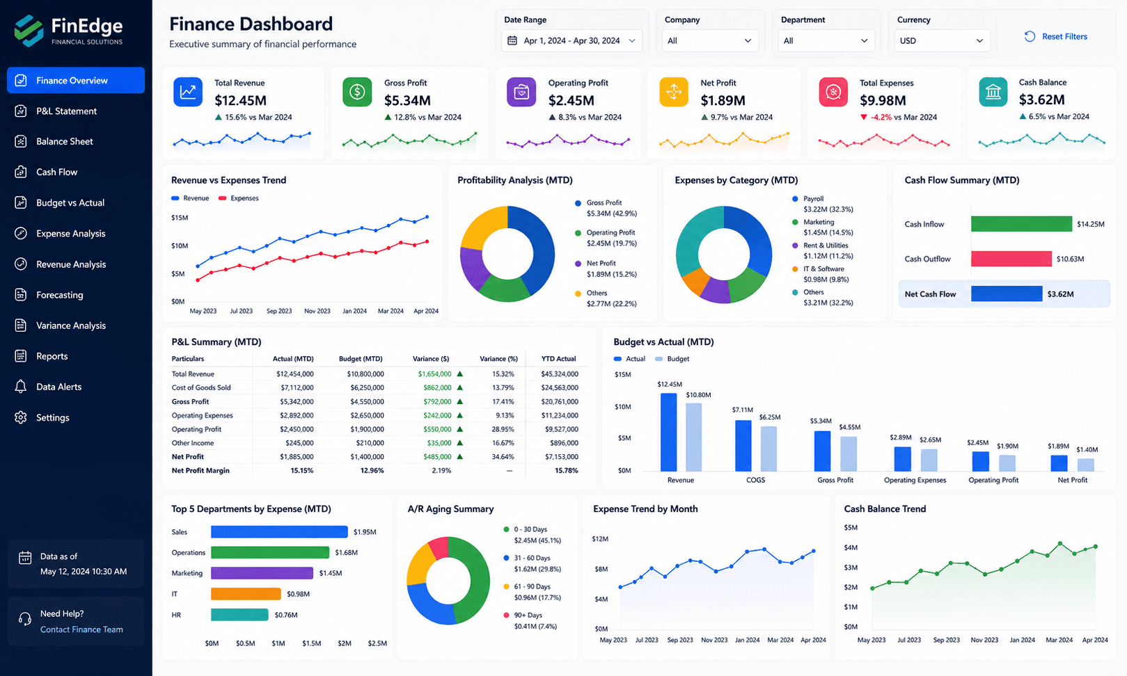
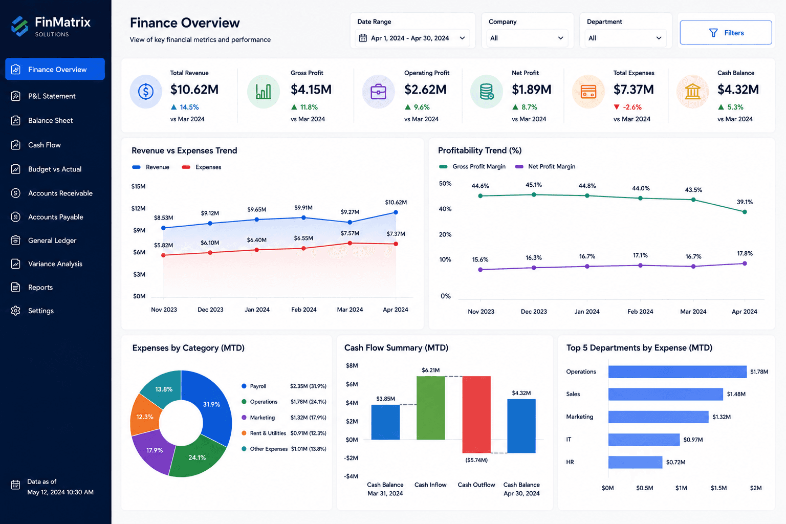
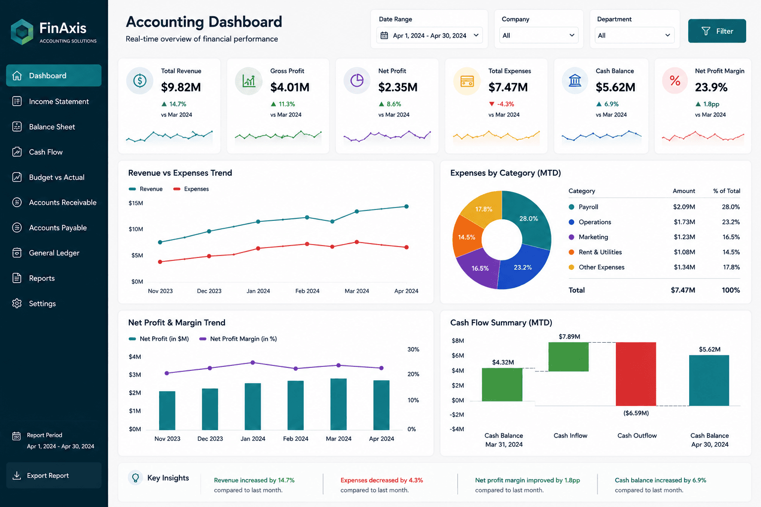
Summary
This Power BI P&L dashboard turns financial statement data into a visual reporting experience.
Project objectives
- Simplify P&L reporting.
- Help managers understand profitability.
- Track expenses before they affect margins.
Business challenge
The client had accounting exports but no simple visual way to explain financial performance.
How the dashboard was built
We reviewed the chart of accounts, mapped income and expense categories, created financial measures, and designed the dashboard around finance review needs.
Solution delivered
We created a Power BI dashboard that summarizes P&L performance using KPI cards, trend charts, and account breakdowns.
Key insights of this dashboard
This dashboard helps users move from a high-level performance view into more specific business insights. It is designed to make trends, gaps, and opportunities easier to identify without relying on manual spreadsheet reporting.
- Profit and loss summary
- Gross and net profit tracking
- Expense category analysis
- Budget variance monitoring
- Monthly financial movement
Client feedback
The client liked how the dashboard made financial reporting more visual and easier to explain.
What you can expect
A similar dashboard can help you understand profit performance quickly and professionally.
Related services
How to use this dashboard
Start with the KPI cards, then use the visuals to compare trends, identify performance changes, and drill into the areas that need attention. In a live version, users can interact with slicers, charts, bookmarks, and report pages.
The interaction, download, and open report options are locked for now. Users can sign up and request the complete dashboard file when you are ready to provide access.