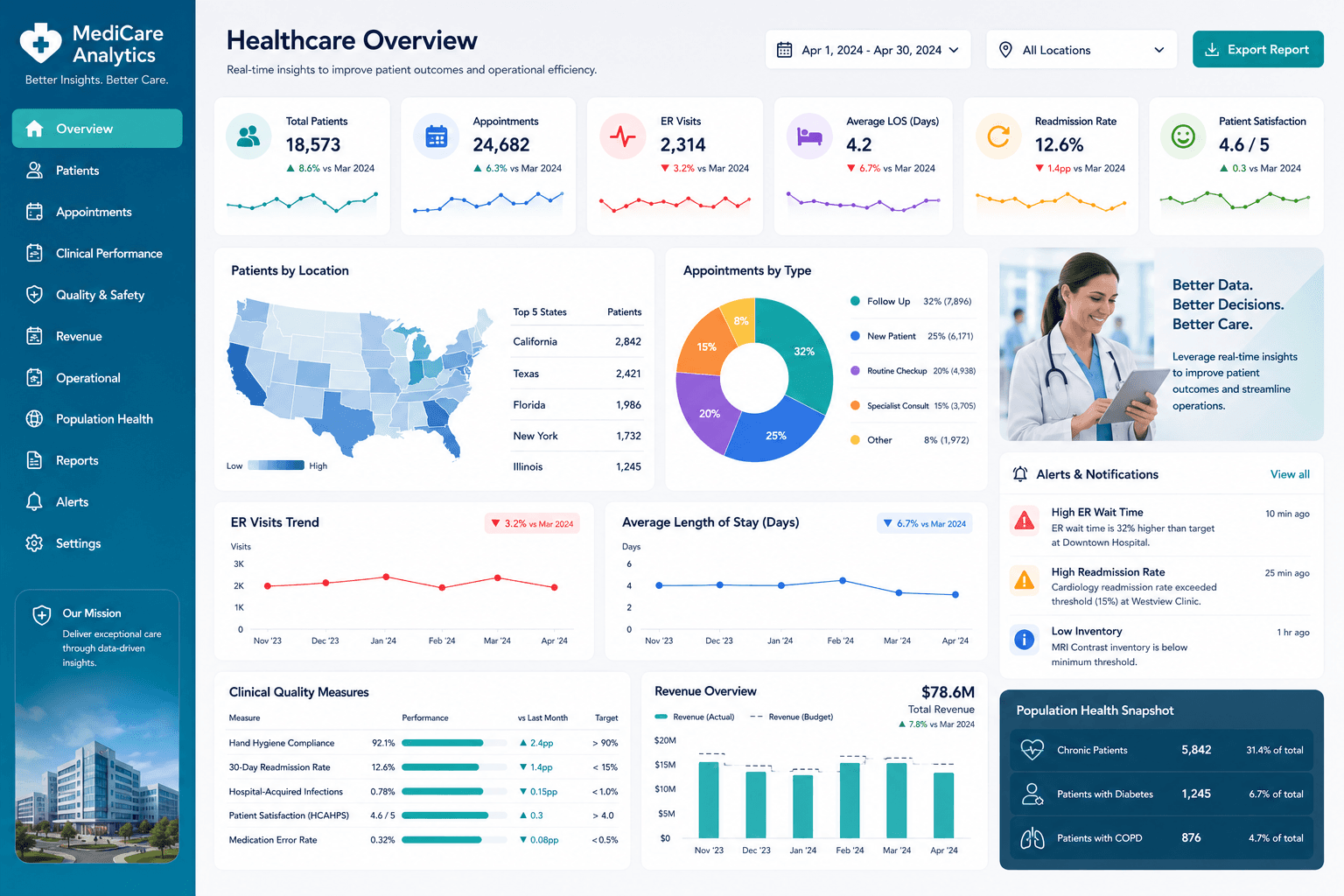
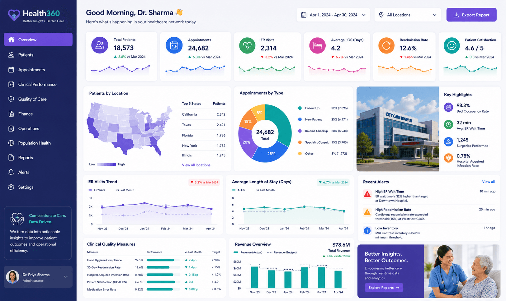
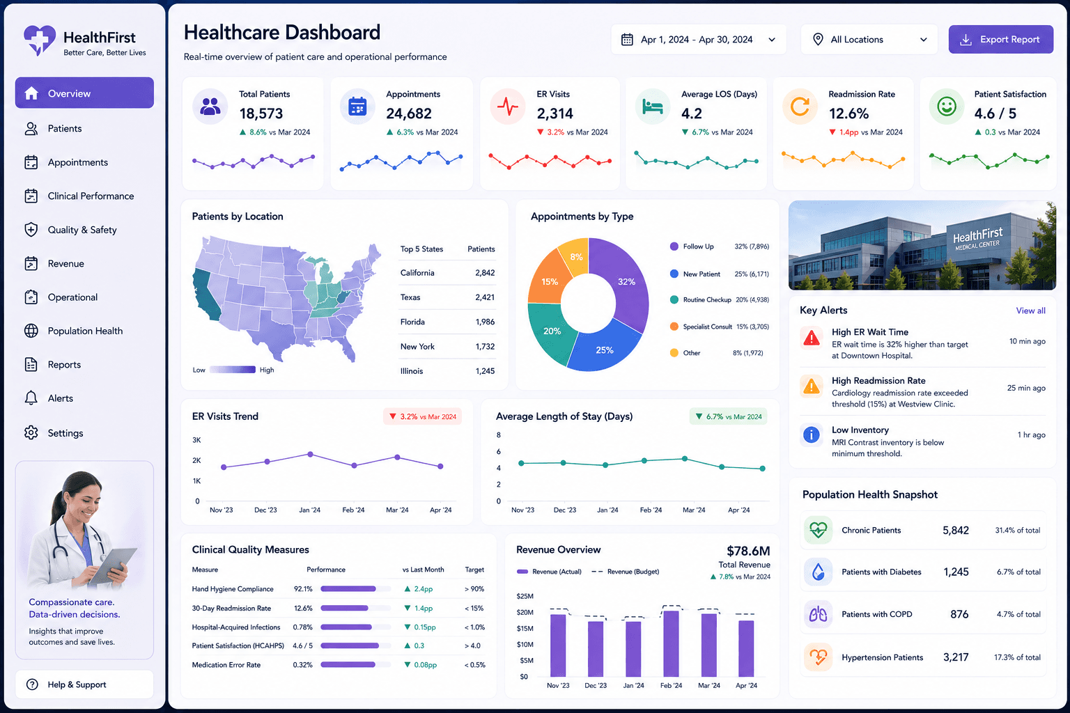
Summary
This patient analytics dashboard gives healthcare managers a clear view of patient activity and service usage.
Project objectives
- Show patient trends clearly.
- Help teams understand demand.
- Support resource allocation.
Business challenge
The client had patient records but lacked a simple dashboard for understanding workload patterns.
How the dashboard was built
We cleaned patient records, grouped service categories, created measures for patient counts and trends, and designed the dashboard around healthcare management questions.
Solution delivered
We created a Power BI dashboard with patient trends, visit analysis, service demand visuals, and interactive filters.
Key insights of this dashboard
This dashboard helps users move from a high-level performance view into more specific business insights. It is designed to make trends, gaps, and opportunities easier to identify without relying on manual spreadsheet reporting.
- Patient visit trends
- Service demand analysis
- Demographic breakdowns
- Department workload tracking
- Healthcare management reporting
Client feedback
The client appreciated that the dashboard made patient data easier to understand and present.
What you can expect
A similar dashboard can help healthcare teams make planning decisions using clearer data.
Related services
How to use this dashboard
Start with the KPI cards, then use the visuals to compare trends, identify performance changes, and drill into the areas that need attention. In a live version, users can interact with slicers, charts, bookmarks, and report pages.
The interaction, download, and open report options are locked for now. Users can sign up and request the complete dashboard file when you are ready to provide access.